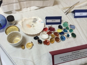
Making Your Own Paints: A Beginner’s Guide

The paints I made (plus some modern gold paint for comparison)
Paints I’ve made (plus some modern gold paint for comparison)

Pigments available to the medieval/renaissance illuminator included mineral and organic ones. The typical palette consisted of:

  • Black: from lamp soot, charred bone, other carbon sources (e.g. vine black, made from charred grape vines)
  • White: lead white; Cennini specifically mentions that other sources of white, such as chalk, have limited value to the artist
  • Browns: typically from various earth sources such as umber
  • Yellows: orpiment (arsenic sulphide), various ochres/earths, tin, saffron
  • Greens: verdigris (copper acetate produced via various chemical reactions), some earths, malachite (a mineral that also derives its color from copper)
  • Blues: lazurite (lapis lazuli, which yielded the expensive and desirable ultramarine blue), azurite, some copper compounds (including some forms of verdigris), indigo
  • Purple: turnsole
  • Reds: madder, minium (lead oxide), vermilion (cinnabar / mercuric sulphide), possibly kermes and cochineal

Continue reading “Making Your Own Paints: A Beginner’s Guide”

Recommended Reading: A Selected Scribal Bibliography

These are some of the books and other sources that I consulted for my scribal project for Kingdom Arts and Sciences, and that I recommended as part of the classes I taught recently. Take a look, hopefully you’ll find something helpful. I have put my top picks in bold:

A page from a French book of hours from around 1400.
A French book of hours from around 1400. Pop quiz if you read the last post: what style is this?

Continue reading “Recommended Reading: A Selected Scribal Bibliography”

Major Styles of Manuscript Illumination: An Art Historical Survey

This is adapted from a handout from a class I taught at a Dragon’s Mist Arts and Sciences day in late April. The full handout is available in the Files section of this blog.

This is a broad overview of major styles in manuscript production in Western Europe. It is NOT a comprehensive list of every type of book art practiced in our time period, although I would love to put that together someday 🙂 This is intended as a guide for scribes, especially charter painters, to begin to recognize distinct styles and make their artwork fit more closely within a target style.

Continue reading “Major Styles of Manuscript Illumination: An Art Historical Survey”

Five Tips to Make Your Charters Look More Historical

This is adapted from a handout from a class I taught at a Dragon’s Mist Arts and Sciences day in late April. The full handout is available in the Files section of this blog.

Sketching and inking an image from a period original

  1. Pick a style and stick to it. Look at multiple examples from the same time period and place as the finished piece that you are basing your work off of or what you are aiming for. Choose similar colors and use the same types of decorative elements. For more information, see my post of an art historical survey of illumination styles.
  2. Use historical or at least historically plausible colors. Avoid layering white over green, and spend enough time studying manuscripts and pigments that you have a sense of what colors were actually available. Scribes in specific time periods and places used distinct color palettes. Spend time looking at accurate facsimiles of medieval illuminations to determine what colors and combinations they found appealing.
  3. Use gold paint or gold leaf, not both. I have found almost no examples were gold paint and gold leaf were both used in the same page, although I’m sure they exist. Leaf was more commonly used prior to the 15th century, after which gold paint seems to be more common. (I’m still researching this and welcome corrections.)
  4. Go through the process of creating an illumination from start to finish, including planning and ruling out the page, at least once. This will help you see how medieval artists conceptualized the page: manuscript art is unique in that it blends both textual and visual elements. Your painting on a charter needs to reflect the artistic style of the design and be somehow united with the text itself.
  5. Keep in mind the purpose of this art form. Illuminated manuscripts were used devotionally both within public spaces of worship and by private individuals. The aesthetic of illumination grew out of this context. Arguably, this is why manuscript illumination was more stylized than realistic. The artwork that we produce within the SCA is wholly secular; however, it does follow the same stylistic conventions. Additionally, the charters and scrolls we produce are intended to produce strong emotions in their viewers, and are physical relics that our Crowns and Coronets provide to those they value highly. SCA scribes surely take their work just as seriously as medieval scribes did!